
Creating Better User Experience: Papyrus Business User Interfaces
The currently observed importance for business digitization strategies are fueled by the worldwide pandemic urging even small- to medium-sized businesses to install solutions for online shops, customer self-servicing applications and seamless work-from-home experiences for employees.
User interfaces are an essential component of business applications that affect the accessibility and ease of work on a daily basis for thousands of users around the world.
An ineffective UI design where information architecture is difficult to understand, overloaded with not essential details or requires dedicated training sessions for newly onboarded employees can become a huge burden and greatly hinder the productivity of an organization, especially in a digital environment.
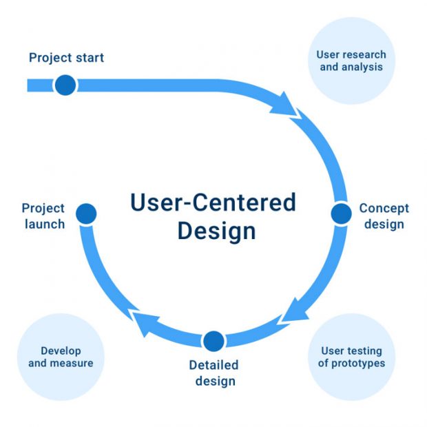
User-Centered Design
To address such topics from a holistic perspective, Papyrus Software has established for more than a decade a User Experience Design team focusing on research, prototyping work and creating usable and attractive applications that meet all customer needs. Our main goal is to create unified Papyrus Business User Interface guidelines by following User Centered Design (UCD) processes and applying usability heuristics that allow design and implementation of consistent and intuitive UIs for our applications across all channels, devices and platforms.
The team at Papyrus Software aims at addressing user experience from a holistic user perspective considering the applied technologies of Papyrus Desktop/EYE Widgets, Papyrus Desktop/HTML and the Papyrus Corporate Mobile App to meet the requirements of business users in the most optimal way for daily work.
In the first step of our design process, we perform user research and gather user stories to better understand their needs. We talk with our users, take interviews with all stakeholders to find out requirements and if feasible, observe how users currently work and which tasks are done in order to reach certain goals.
The resulting user stories are grouped by contexts with their associated actions in order to map them into use cases. Next steps require intensive wireframing and prototyping phase in which we explore and test possible solutions in several iterations. When this phase is complete and conceptual approach agreed, we start with the detailed design of all UI elements and screens in a pixel-perfect way.
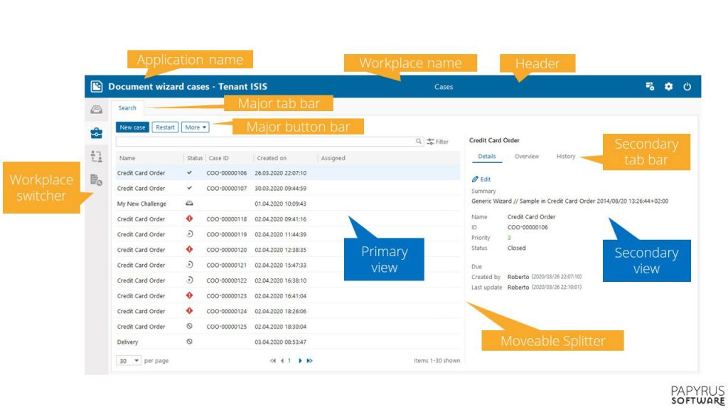
Resulting mocks, icons and specification are then discussed with our developers who can now start an actual implementation. The figure shows how a typical Papyrus application is composed from UI components that are defined in the Papyrus Business User Interface guidelines:
New Papyrus EYE Widget Style
With Papyrus V7.6 we have introduced a modernized stylesheet for the Papyrus EYE Widget applications which will become the default with Papyrus V7.7. It is the first major style optimization since the Papyrus blue style was launched in 2014 and addresses the following areas:
Spacious design
We give most of the UI elements more space and reduce or remove unnecessary elements like borders, boxes, dots, etc. that are distracting and overwhelming to users. It de-clutters the page structure helping users to understand the content quicker.
Consistency
Using the same spacing for margins and paddings in combination with the new font Segoe UI to improve the look and feel across all applications.
Usability
Slightly bigger UI elements like buttons and bigger font sizes allow for an easier usage of the applications, considering also the needs of users with reduced eye sight capabilities.
Splitters
The borders between different panes become a fine line in order to create a smooth flow when navigating.
Tables concept
Tables have an improved style with less visual load and more space for easier content readability.

Papyrus Academy User Experience Team Lead
Vienna, Austria